

Warning signs play an important role in public safety by communicating hazards and helping people navigate shared spaces. Safety signage provides a visible reminder — guiding behaviour, flagging hazards, and supporting emergency response. Effective visual safety communication is not simply about putting up a few signs; it demands thoughtful design, strategic placement, and regular upkeep.
Key takeaways
- Workplace safety signage acts as a constant communicator that helps guide behavior and mitigate hazards when supervisors are not present.
- Effective warning signs should prioritize simplicity and use universally recognized symbols and high-contrast colors to ensure rapid comprehension.
- Standardizing color-coding and symbols across a facility reduces confusion and helps employees make quicker, safer decisions under pressure.
- Signs must be positioned directly at the source of the hazard rather than grouped together to ensure they are seen when needed most.
- Visibility should be assessed based on real-world conditions, including lighting, sight lines, and the movement patterns of staff within the workspace.
- Regular maintenance and the periodic refreshing of signage are essential to prevent fading and combat employee inattention caused by familiarity.
How do you design warning signage that employees actually notice and understand?
The fundamental challenge with workplace hazard warnings is cutting through the noise of a busy environment. Research in the field of visual perception consistently highlights that the human brain processes images far more rapidly than written text, which is why well-designed safety signs can communicate danger almost instantaneously. When crafting clear safety messaging, simplicity is the guiding principle: each sign should carry a single, focused message rather than cramming multiple instructions onto one board.

What visual elements make safety signs effective in high-risk environments?
In high-risk environments, the visual elements of a sign determine whether it gets noticed or ignored. Bold, contrasting colours draw the eye immediately, while universally recognised symbols transcend language barriers and support accessibility across different shifts and workforce backgrounds. Industrial signage must also be produced from durable materials suited to the environment — surfaces exposed to moisture, UV light, or heavy traffic call for specialist materials that resist fading and wear. Readability at a glance, with clean fonts and uncluttered layouts, is essential for ensuring quick comprehension under pressure.
Why standardised symbols and colour coding reduce workplace accidents
Inconsistency in safety signage standards can create genuine confusion on site. When different areas of a workplace use varying colour schemes or symbols for similar hazards, employees can misread a warning at precisely the moment it matters most. Adopting a coherent colour-coding system — for instance, green reserved for first aid information and red for fire safety — builds a visual language that becomes second nature to staff. This kind of standardisation, aligned with recognised regulatory compliance frameworks, reinforces safety culture by making expectations consistently clear. It also supports accident prevention by reducing the cognitive load on workers who must make quick decisions.
Where should warning signs be positioned to maximise workplace safety compliance?
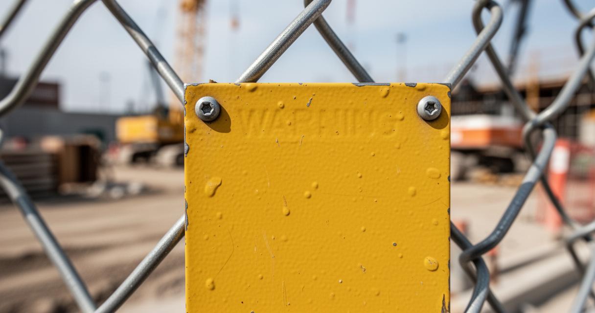
Even the most beautifully designed sign fails if nobody sees it. Positioning is therefore as critical as design in any safety management system. Signs should be located at the precise point where the relevant hazard exists, rather than grouped together in a central noticeboard where they compete for attention. Site safety boards can provide an overview of site-wide safety protocols, but individual hazard warnings must be placed directly at the source of risk.
How sight lines and lighting conditions affect signage visibility
Effective operational safety depends on signs being visible under the actual conditions in which workers operate. A sign positioned behind a door, obscured by equipment, or placed in a poorly lit corridor is effectively invisible. When assessing placement, it is worth considering natural and artificial lighting at different times of day, as well as the typical movement patterns of staff. Floor signs can be particularly effective in high-traffic areas, reinforcing messages at eye level and underfoot simultaneously, adding a layer of visual reinforcement to overhead or wall-mounted signage.

What maintenance routines keep warning communications clear and legible
Over time, familiarity breeds inattention. Customised signage that reflects the specific risks of a given site tends to feel more relevant and can hold attention more effectively than generic alternatives. Beyond initial installation, a regular review schedule is essential: signs that have faded, become damaged, or been overtaken by changes to the workplace layout should be replaced promptly. Rotating or refreshing signage periodically helps prevent employees from becoming so accustomed to a sign that it fades into the background. Health and safety compliance is an ongoing process, not a one-time installation, and treating hazard communication as a living part of workplace risk management is what separates genuinely safe workplaces from those that simply appear to tick boxes.